ROTTERDAM VISUAL IDENTITY - ROTTERDAM VISUAL IDENTITY - ROTTERDAM VISUAL IDENTITY - ROTTERDAM VISUAL IDENTITY - ROTTERDAM VISUAL IDENTITY - ROTTERDAM VISUAL IDENTITY - ROTTERDAM VISUAL IDENTITY -
ROTTERDAM VISUAL IDENTITY - ROTTERDAM VISUAL IDENTITY - ROTTERDAM VISUAL IDENTITY -
VISUAL IDENTITY FOR ROTTERDAM
[Conceptual project]
Rotterdam is a true amusement park for lovers of architecture and urban planning. Here you can find constructions of all possible shapes, some of which seem to come from the future. And this is not for some kind of design display. All these buildings are suitable for living, playing and working. It is amazing how everything looks so harmoniously in one place.
Rotterdam is the city of the future: “The city has undergone a remarkable change in the last 20 years, and architecture is playing an important role in it” Rotterdam is becoming a center of architecture, an experimental architectural laboratory without limits. Since its postwar rebuilding, the tabula rasa version, like a white sheet, has spawned limitless imagination. It is a city where architecture was born out of audacious imagination, chaos and urban deformity, where countless architectures and styles merge in a particular way. Everything is possible in Rotterdam. And so it’s continued. Between deconstruction and reconstruction and experimental continuation, the concept of this identity was born.

Deconstruction
+ Reconstruction
+ Experimental Laboratory of Architecture
+ Different architectures =
Different Pieces,
Loose,
Each with it’s own personality.
Restart?
A NEW CITY
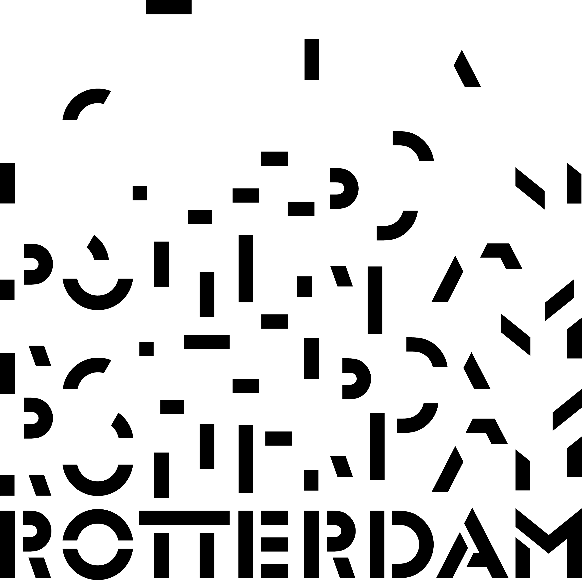
To position Rotterdam with an innovative brand image that represents the concept of a Tetris-like city as an architectural laboratory, it was necessary to define a modern, loud, playful, versatile, and flexible brand identity. In this way, the visual identity is born from a stencil typography, which allows its deconstruction/reconstruction to create shapes, icons, messages, and all the necessary graphics – a form that reflects the message of the city's past, present, and future.
Glaser Stencil,
by Milton Glaser, was the typography used – its bold and modernist voice, along
with its form and counter form, represents the values to be conveyed in
Rotterdam's new identity.


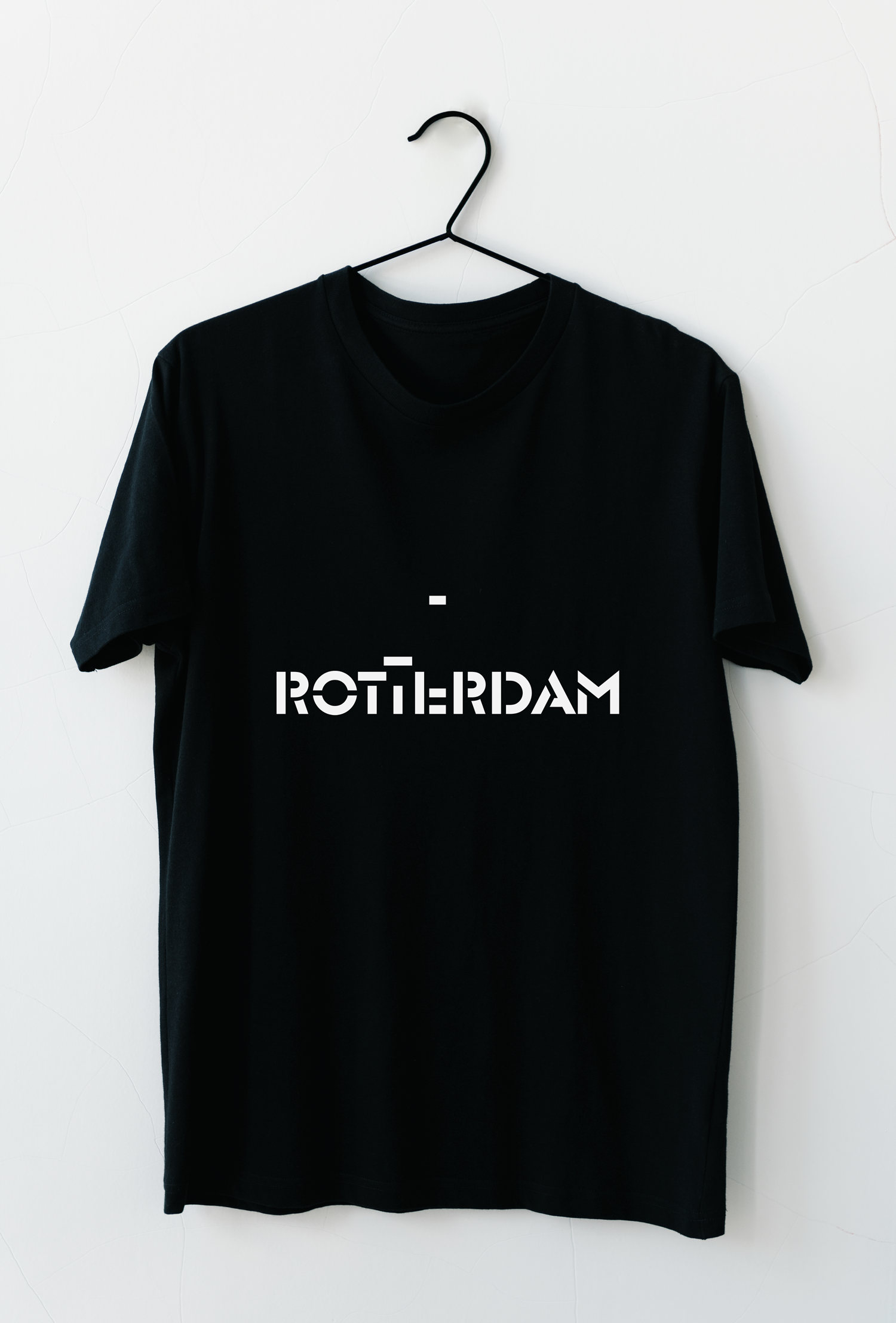
Glaser Stencil gives rise to the wordmark and, in its uniformity, represents the city of Rotterdam. However, the concept implies that it undergoes decomposition to create the entire identity, where parts of the letters separate, referring to the idea of distinct architectural styles that emerged throughout the city after World War II. In this way, the logo wordmark is born in the same manner as the city of Rotterdam was reborn. Designed to be responsive, this wordmark faces a reduction of letters down to the result of a graphic icon for smaller dimensions.


ICONOGRAPHY:
PARKS AND NATURE
ARCHITECTURE
BICING
THE PORT
ARTS AND CULTURE
WINDMILLS
PARKS AND NATURE
ARCHITECTURE
BICING
THE PORT
ARTS AND CULTURE
WINDMILLS
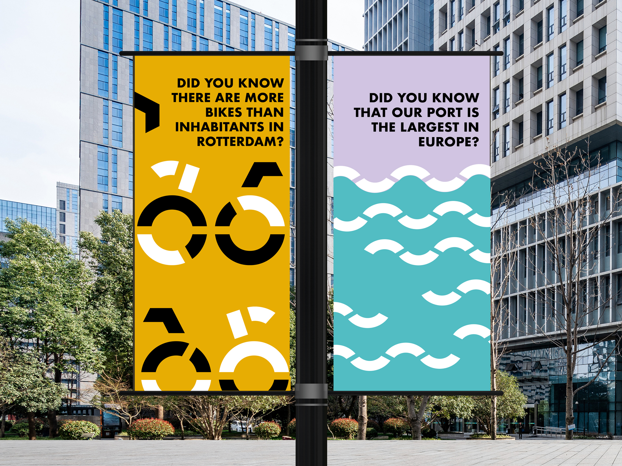
The typeface used is the protagonist of Rotterdam. Starting from the wordmark and these detached pieces, an infinite iconography can be created to represent the city's main values and attractions, leading to a varied illustration of multiple banners, copy, posters, and furniture (3D pieces) throughout the city.
Once again, the concept deepens.

