DRYPE VISUAL IDENTITY - DRYPE VISUAL IDENTITY - DRYPE VISUAL IDENTITY - DRYPE VISUAL IDENTITY - DRYPE VISUAL IDENTITY - DRYPE VISUAL IDENTITY - DRYPE VISUAL IDENTITY - DRYPE VISUAL IDENTITY -
DRYPE VISUAL IDENTITY - DRYPE VISUAL IDENTITY - DRYPE VISUAL IDENTITY - DRYPE VISUAL IDENTITY -
VISUAL IDENTITY FOR DRYPE
[Competition Proposal - Golden Mention]
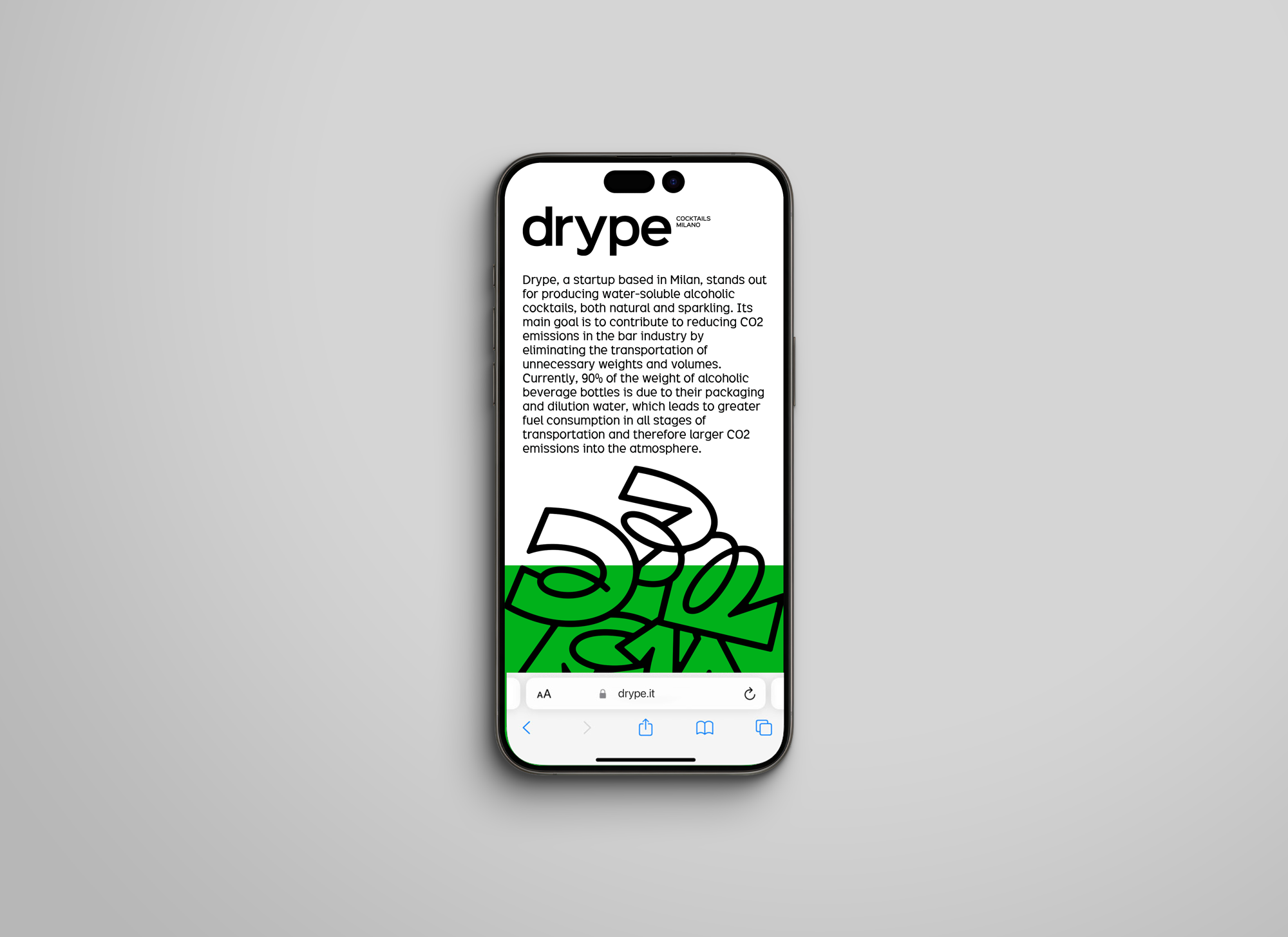
Drype, a startup based in Milan, stands out for producing water-soluble alcoholic cocktails, both natural and sparkling. Its main goal is to contribute to reducing CO2 emissions in the bar industry by eliminating the transportation of unnecessary weights and volumes. Some of the Drype’s values are sustainability, innovation and creativity, aiming for a youthful and modern tone of voice -
Drype wanted to be cool, fun, cheerful and unique.
Drype is a brand of innovation. It must stand out from the rest. After all, Drype is a pioneer in breaking barriers within this industry, being a game-changer, an innovative project and action that should be highlighted.
The values that gave birth to the concept presented were circularity, innovation, and creativity. However, the core of this concept lies in the revolutionary and unique aspect of this project: an avant-garde design that aims to generate change, be daring and bold, following a pioneering, revolutionary, and cutting-edge new cocktail experience. Based on this, the concept aims to create a symbol that highlights the brand, like a fingerprint, a signature, a graphic symbol that the community recognizes as the revolutionaries of the alcohol industry for a more sustainable world. A young and unique symbol that marks a position of change, representing the union and connection between us and the earth, expressing consciousness! And above all, circularity and progress. A brand that hopes to be everywhere, seen and recognized everywhere.

There are three key principles of tone that bring Drype to life:
Revolutionary and Pioneering: Drype's tone must carries a revolutionary spirit, standing out as unique and distinct from the rest. Drype is one of a kind.
Environmental Commitment: It should emphasize Drype's dedication to environmental responsibility, sustainability and circularity.
Youthful, Fun and Friendly: The tone should be young, approachable, and friendly.

The design process for creating the visual identity was based on the development of five key words, which served as a starting point. These words were then broken down into related semantic concepts, including metaphors, shapes, synonyms, related concepts, etc. From this, a set of figures was created, such as icons, diagrams, metaphorical figures, identifiers, and marks, all of which were connected to these key words.
Based on this, an analysis was conducted on the words and gestures that were most interconnected and frequently repeated, initially generating various ideas. However, the main focus centered on certain semantic concepts and their respective figures, which ultimately simplified into a final concept.
From here, it was possible to start creating the logo. It became clear that a circular symbol would be important to reinforce the themes of sustainability, wholeness, unity, infinity, and circularity. The connection, novelty, and revolutionary aspect will be achieved through the arrangement and formal logic of the components that make up the logo.

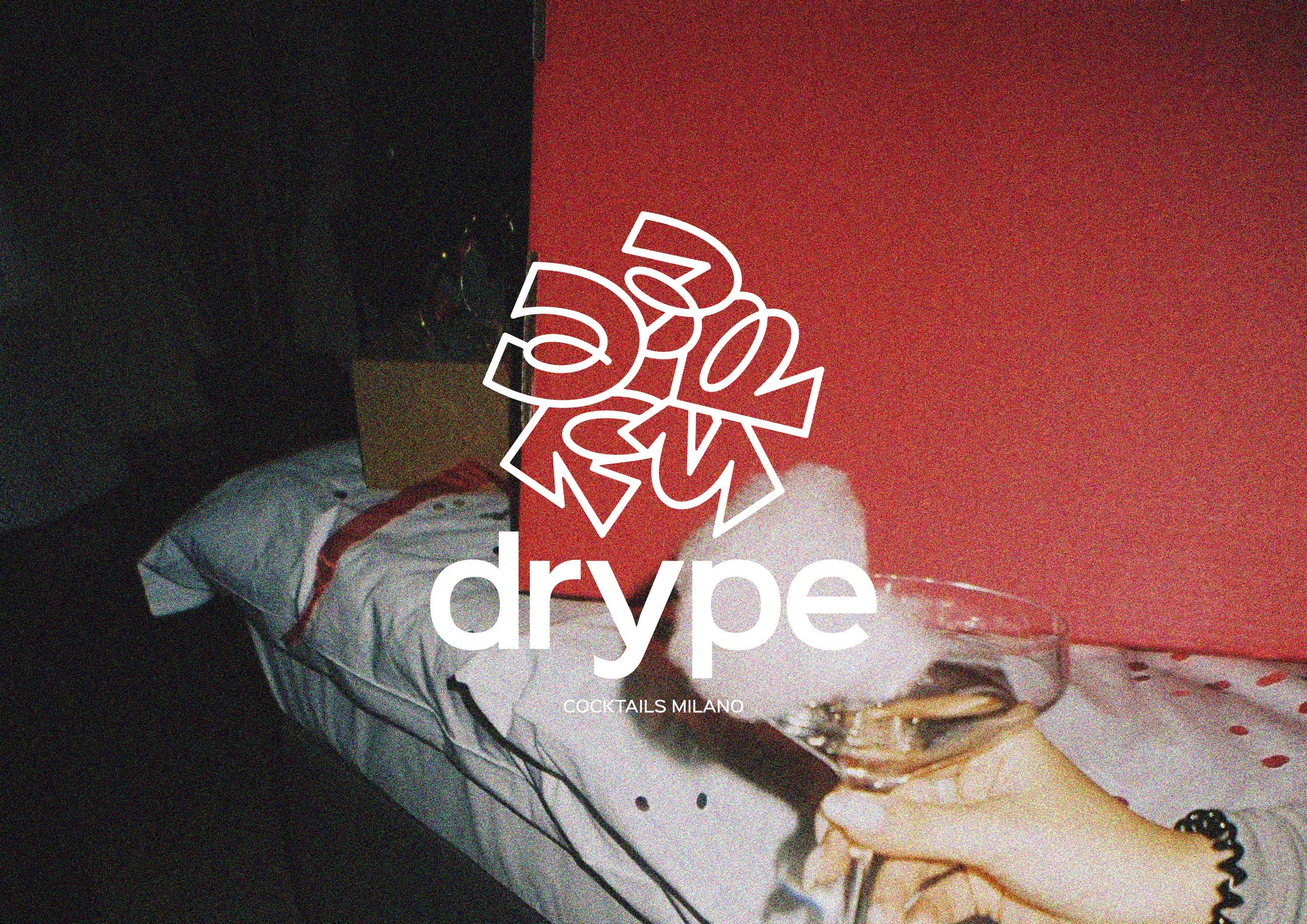
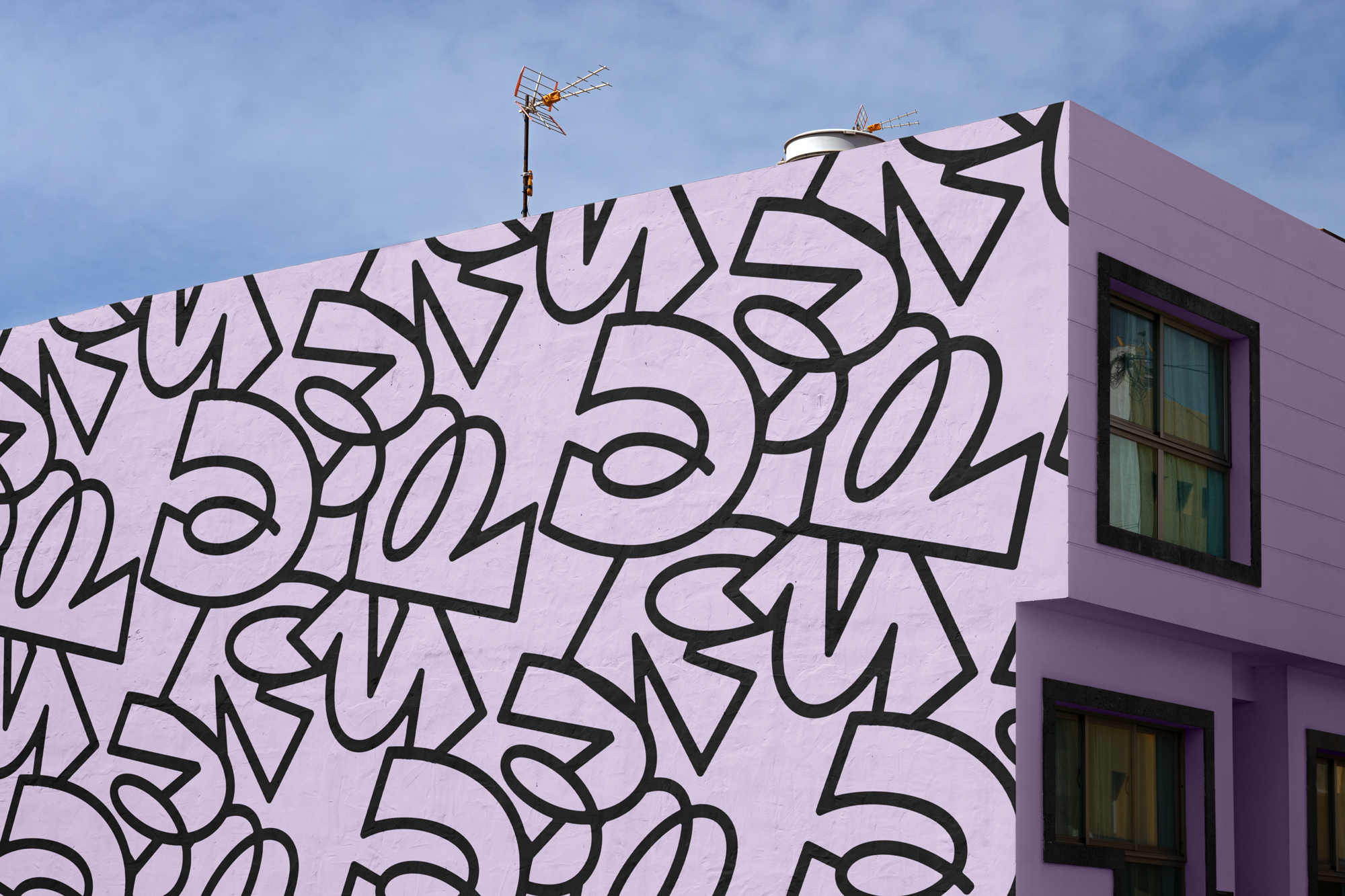
Based on a typography with an accentuated format that represents expression, signature, youthfulness, and revolution, the letters of the word DRYPE form a circle and connect with each other to reinforce the idea of our connection with the planet and the circulation of resources. The personality of these letters demands a certain attention – the contrast between organic lines and sharp angles is a metaphorical representation of the exciting sensation of a new brand in the world - like an urban signature.
It takes on the form of an iconic urban signature that begs to be seen everywhere – like a cool “tag” that marks its presence within the industry, while alsorecalling an organic shape that has been abstracted, thus creating a connection between us, the urban environment and the earth.


The typeface selected was The Excite. It is a neo-grotesque typeface. This typeface has a distinctive character, with punctuation marks, a hexagonal dot/period, resembling the Drype symbol, reinforcing the geometric visual identity. Additionally, unlike typical neo-grotesque typefaces, Excite features a sleek, single-story lowercase “a”, which aligns with Drype’s concept of standing out from the crowd.
Excite boasts a tall x-height, which ensures a clear distinction between uppercase and lowercase letters, making it highly readable both in print and on screens. Its modern, spacious design includes short ascenders and descenders, as typeface used for the logo, contributing to an overall airy appearance. This airiness is further emphasized by the horizontal and vertical terminations on open characters such as 'C', 'S', and '3'.


For a brand with a strong graphic presence and impactful messaging, bold colors are essential. The chosen colors are designed to stand out and enhance the overall visual identity and also in combination with materials such as carton or aluminium. In a minimalist approach, these colors should be used exclusively with white or black, and never combined with each other.
The palette is inspired by the names of cocktails, allowing for future expansions if necessary.


